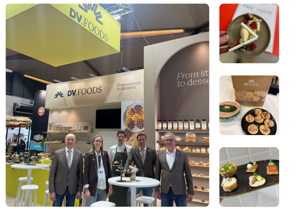
At DV Foods, we proudly present our new logo and brand identity. These reflect our dedication to quality and innovation. The new, sleek design clearly showcases our values and ambitions, while maintaining recognition for our customers.
If you’re familiar with our brand, you’ve probably already noticed it while scrolling through our social media feed or during your visit to our website: a fresh breeze is blowing through DV Foods. Contemporary colors and a modern logo make our brand up-to-date, without losing the connection to our former identity and business philosophy.
Layers of meaning
DV has stood for Dirk Verwilst for over 30 years. The founder of our company remains essential, even in the new design. The logo consists of a flat D with multiple V’s on the curved side. These V’s form a fan, referring to the wide range of products we have developed over the years. Lastly, the details of the letter show a kind of layering. These layers symbolize the leaves of puff pastry, a basic element in many of our products and where the high-quality range began.
It is clear that an incredible amount is encapsulated in just two letters. Just like every product of DV Foods holds a complete experience.
With this rebranding, we are even more motivated and confident for the next 30 years – and beyond.


